LASER CUT DEPOT
Precision in Identity
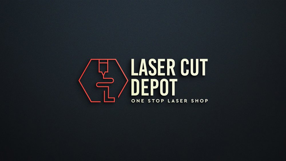
Precision meets accessibility in this identity for a laser cutting service. The name emerged from strategy sessions focused on combining technical expertise with customer convenience. The hexagonal design system, with its clean geometric approach, mirrors the precision of laser technology while maintaining visual simplicity.
THE CHALLENGE
Create a sophisticated logo for a laser cutting service that communicates technical precision while maintaining visual simplicity and modern appeal. The design needed to work across multiple applications while clearly representing the business’s core service.
THE SOLUTION
Developed a minimal yet meaningful design that:
- Combined hexagonal container with linear laser icon
- Used clean, continuous line work
- Created an abstract laser head and beam path
- Applied strategic negative space
- Selected impactful coral red accent color
- Balanced with off-white typography
- Set against deep navy background
DESIGN ELEMENTS
- Geometric hexagon frame suggests technical precision
- Single-line illustration style mirrors laser cutting process
- Modern sans-serif typography projects professionalism
- Clever integration of ‘LCD’ initials within icon
- Dimensional presentation through subtle shadowing
- Clear tagline reinforces service offering
- Versatile design works in both flat and 3D applications
Logo Design