BIRD'S EYE PILOT
Elevating Drone Identity
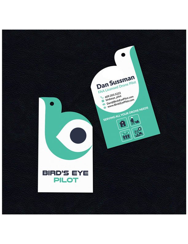
A drone service needed to soar above the competition. Our naming process elevated “drone operator” to something more compelling – BIRD’S EYE PILOT. The identity system, complete with innovative die-cut business cards, transforms technical capability into visual poetry. Every touchpoint reinforces precision while maintaining approachable professionalism.
THE CHALLENGE
Create a distinctive brand identity for a professional drone service that combines playful creativity with technical credibility, including an innovative business card design that stands out from competitors.
THE SOLUTION
Developed a cohesive brand system featuring:
- Clever bird/eye symbol integration
- Custom die-cut business card shape
- Dual-sided card design
- Strategic use of white space
- Professional service icons
- Clean typography hierarchy
DESIGN INNOVATION
- Bird-shaped die-cut card becomes memorable takeaway
- Mint green and navy color palette suggests trust and innovation
- Minimal geometric bird form doubles as camera eye
- Negative space creates visual interest
- Service icons communicate capabilities
- Contact information flows with card shape
- Card design encourages interaction
- Two-tone approach maximizes impact
Logo Design
Business Card Design